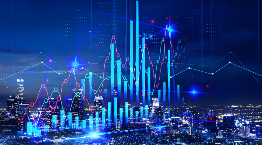
That line graph you see flashing on financial news—the Fed interest rates chart—is more than just squiggles. It's the financial world's vital signs monitor. It dictates what you pay on your mortgage, what you earn on your savings, and sets the tone for your investment portfolio. But most people look at it and see just history. The real skill is learning to read the trend, the context, and the future hints buried in the data. Let's strip away the jargon and turn that chart into a practical tool you can use.
What You'll Learn in This Guide
How to Read a Fed Interest Rates Chart Like a Pro
First, know what you're looking at. The most common chart tracks the Federal Funds Target Rate. This is the interest rate banks charge each other for overnight loans. It's the primary lever the Fed pulls to cool down or heat up the economy.
The Three Key Elements of Any Good Chart
Don't just glance at the current dot. A meaningful analysis looks at three things:
- The Slope: Is the line going up steeply (aggressive hiking), going down (cutting), or flat? A steep climb often signals the Fed is very worried about inflation. A long flat line suggests a "wait-and-see" policy.
- The Plateau Levels: Notice where the line stays flat for a while. These plateaus, like the near-zero period after the 2008 crisis and during COVID-19, define entire economic eras of cheap money.
- The Magnitude of Changes: A 0.25% hike is a gentle tap. A 0.75% hike, which we saw in 2022, is a sledgehammer. The size of the moves tells you the Fed's level of urgency.
Historical Context is Everything
Seeing a rate at 5% might seem high if you've only looked at the last 15 years. But zoom out. Look at a chart covering the 1980s, and you'll see rates peaking above 19%. That context changes everything. It tells you what the Fed is truly capable of when fighting runaway inflation.
| Period | Average Fed Funds Rate | Economic Backdrop | Key Lesson for Today |
|---|---|---|---|
| Early 1980s | ~15% | Volcker's war on inflation | The Fed can be aggressive if needed. |
| 2003-2006 | 1% to 5.25% | Gradual hikes pre-Great Recession | Slow hikes can still pop a bubble. |
| 2009-2015 | ~0% | Recovery from financial crisis | Rates can stay "lower for longer." |
| 2022-2023 | 0% to 5.5% | Post-pandemic inflation surge | The hiking cycle can be the fastest in decades. |
The Direct Impact on Your Mortgage and Loans
This is where the rubber meets the road. The Fed Funds Rate doesn't directly set your mortgage rate, but it's the foundation. Mortgage rates typically track the 10-year Treasury yield, which is heavily influenced by expectations for Fed policy.
When the chart shows a rising trend, lenders start pricing in future hikes. Your 30-year fixed mortgage rate climbs. For a $400,000 loan, a difference of just 1% in the rate changes your monthly payment by about $250. That's real money.
Here's a non-obvious point: the chart affects loan availability, not just cost. When rates spike quickly, some lenders tighten standards. That "great rate" you saw online might vanish if your credit score isn't pristine. During a fast-rising rate environment, getting pre-approved becomes more critical than ever.
What It Means for Your Savings and Investments
For years, the chart was a flat line near zero. Savings accounts paid nothing. That era trained us to ignore interest income. A rising rate chart flips that script.
For Savers: The Silver Lining
High-Yield Savings Accounts (HYSAs) and Certificates of Deposit (CDs) finally start earning meaningful yields. This is the chart's gift to savers and retirees. You don't need to take big risks to get a 4-5% return. You can just shop around online.
But there's a lag. Banks are slow to raise savings rates and quick to raise loan rates. You have to be proactive and move your money to the banks competing hardest for deposits.
For Investors: The Sector Shuffle
A climbing rate chart acts like a magnet, pulling money out of risky assets. It reshuffles the deck.
- Growth Stocks (Tech): Often struggle. Their high valuations are based on profits far in the future, which are worth less when discounted at higher interest rates.
- Value Stocks & Banks: Can perform better. Banks make more money on the spread between what they pay for deposits and what they charge for loans.
- Bonds: Existing bonds lose market value when rates rise. But new bonds are issued with higher coupons, making them more attractive. This is why bond laddering becomes a smarter strategy in a rising rate environment.
The chart tells you what kind of investment weather you're in. A steep upward slope means batten down the hatches on speculative bets. A flattening or downward slope suggests it might be time to start looking at growth again.
Common Mistakes People Make (And How to Avoid Them)
I've seen smart people get this wrong for years.
Mistake #1: Focusing only on the headline rate. They see "Fed hikes by 0.25%" and think that's the whole story. They miss the nuance in the Fed Chair's press conference—the tone, the emphasis on data dependency, the hints about pausing. The chart gives you the "what," but the statements give you the "why" and "what's next."
Mistake #2: Assuming a direct, immediate pass-through. "The Fed hiked, so my variable rate will go up tomorrow." Not always. It depends on your loan's benchmark (e.g., Prime Rate, SOFR). Know what your loan is tied to. Check its terms.
Mistake #3: Extrapolating the trend forever. Markets are cyclical. A chart that's been going up for 18 months will eventually peak and turn. The biggest opportunities often arise when the market is anticipating a pivot in the chart's direction, not during the steady climb. Watching indicators like the Consumer Price Index (CPI) and unemployment data gives you clues about that pivot.
A Real-Life Case: Sarah's Home-Buying Dilemma
Let's make this concrete. In early 2022, Sarah was looking to buy. The Fed chart had just started ticking up from zero. Her agent said, "Rates are still historically low, buy now!"
But Sarah looked at the chart's slope. It wasn't a gentle rise; it was the beginning of a sharp climb. The Fed was clearly signaling more, bigger hikes to come. She also read the meeting minutes, which were hawkish.
Instead of a 30-year fixed, she opted for a 7/1 ARM with a much lower initial rate, planning to refinance when the chart eventually flattened. She also negotiated harder on the home price, arguing that rising financing costs would cool demand (which they did). By mid-2023, she had saved tens of thousands versus someone who locked a high fixed rate at the peak of the hiking frenzy. She used the chart not as a crystal ball, but as a guide to probability and risk.
Your Fed Chart Questions, Answered
The Fed interest rates chart isn't just for economists on TV. It's a map of the financial landscape you have to navigate. By learning to read its slopes, plateaus, and turning points, you stop being a passenger reacting to news headlines. You start making informed, proactive decisions about your biggest financial commitments—your home, your savings, and your future.
Bookmark the chart on the Fed's site. Glance at it before you make a big money decision. Over time, you'll start to see the story it's telling, and that story is all about the cost of money in your life.